To Quick Shop or not
Recently I’ve been invited to speak on an upcoming Shopify podcast. The host asked me about practical tips for speed optimization that store owners can perform on their websites alone. The first thing I said?
Turn off the Quick Shop functionality on your Shopify store!
I’ll explain why in a series of posts. Let’s start with the first reason:
1. Quick shop doesn’t work on mobile
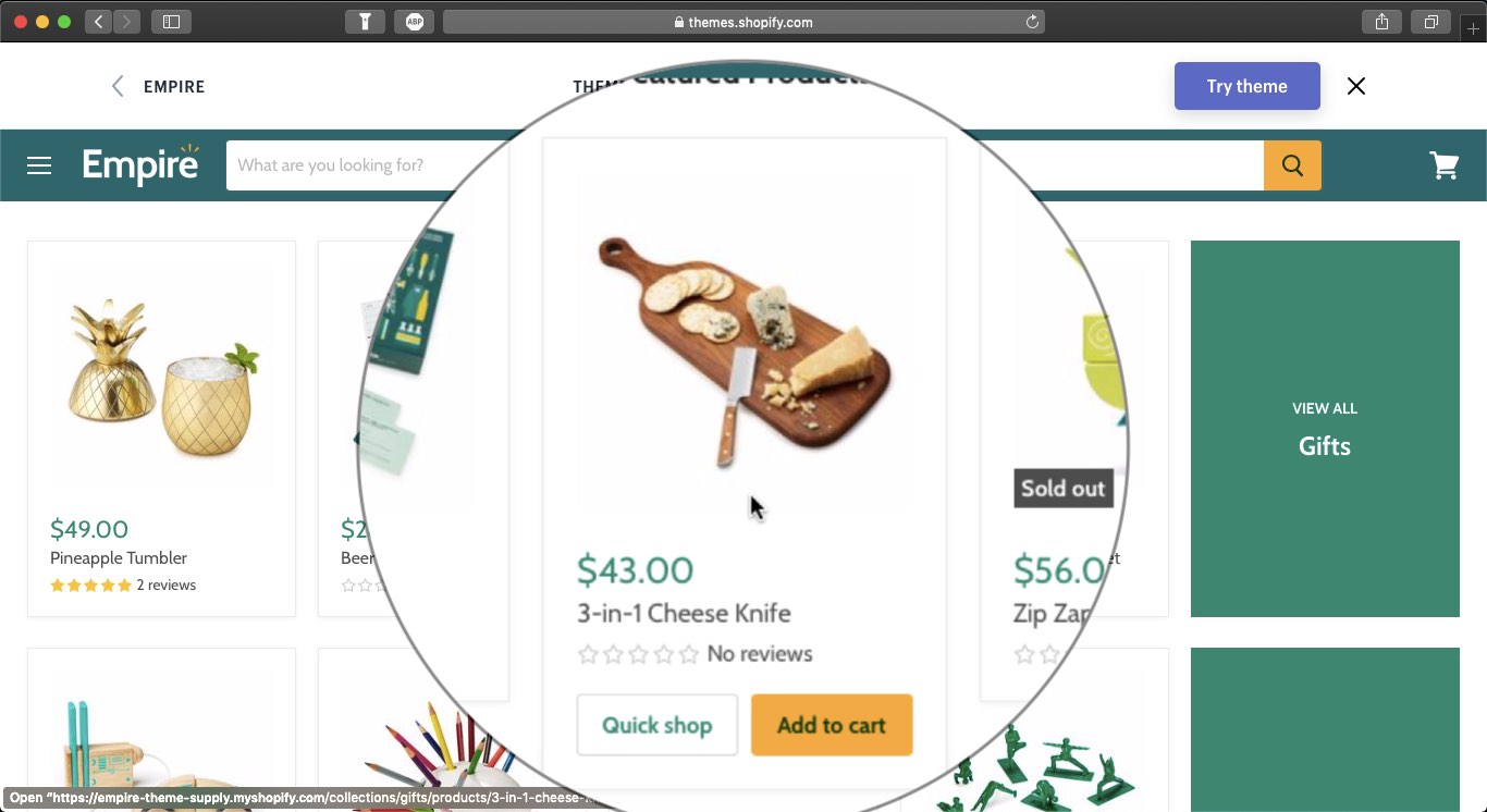
All of the quick shop implementations in popular themes depend on having a mouse cursor with which you can hover over a product listing. Only then the quick shop button is displayed. Want visual proof?
 Here is a preview of the Empire theme on the Shopify Theme Store. When you hover over a product from a product list you get Quick Shop and Add to Cart options.
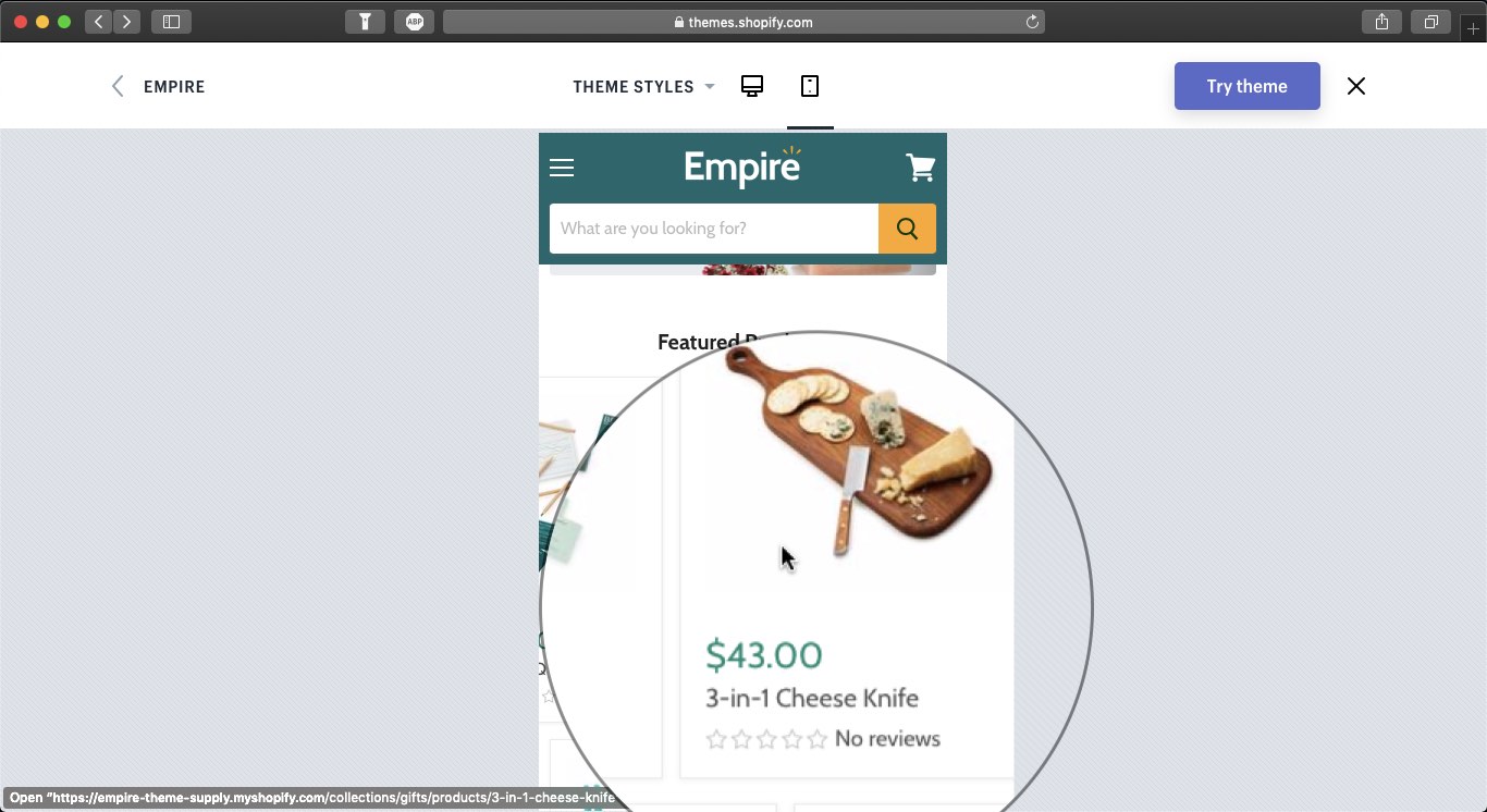
 Here is the same page, in responsive mobile view, and I’m hovering over the same product. You can’t see the Quick Shop and Add to Cart buttons anymore, because on mobile new rules are in place. Even if you could see it in my desktop preview, it wouldn’t be available on mobile, because there would be no cursor.
Side note: if the developers made this functionality available on mobile it would require double tapping a product item—the first tap would show the Quick Shop and Add to Cart buttons(triggering the cursor hover event) and the second would count as a click/tap. That would quickly annoy your visitors, as it is not the convention they are used to when browsing sites on mobile.
You may quickly justify these options as a store owner with “I’m making it easy for people to shop!”, but sadly, that’s not the case.
The presence of Quick Shop functionality makes shopping harder for your mobile visitors
While the feature is not visually present on mobile, the code needed for it is still downloaded and processed. And that code comes with its own set of burdens:
- Pages takes more time to be generated on the server
Because of the added complexity of getting product details upfront for a dozen or more items, preparing the initial page that your visitors would download takes more server time. This increases the TTFB, the time it takes a visitor to get first response from your website. This results in a lot of waiting before page loading even begins. - Quick Shop code bloats the page
To be able to quickly show a product, the information for it (and sometimes images) must already be present. This way, when you click it the product info immediately pops up on your screen. This code increases the HTML page size by 5 to 10 times in most cases and the overall page weight by 3 to 5 times (because of all the images that may never be used that get loaded). All that data needs to be downloaded by your visitors. This results in long loading times after the visitor started loading the page and before something meaningful shows up on screen. Even if they endure through the pain of getting the page, they get nothing in return, as mobile visitors can’t access Quick Shop. - More code = more local processing time
All of the downloaded resources are being processed by the browser so that it knows what to do with them. Code is evaluated and then run. In the Quick Shop case, 80% of the evaluated, i.e. processed code, is not going to execute for the mobile visitor. Still, code processing delays the perceived progress of the loading and stalls the web page before it can become interactive.
All of the above are issues desktop visitors experience, too but are especially painful on smartphones where resources are limited.
With mobile visitors accounting for 60 to 80% of the total traffic to your website, there is no point of keeping a feature they can’t even use. Moreover, there is no reason to keep a feature that slows down the shopping experience for all of your visitors. Get rid of Quick Shop now!
If you’ve read this far, you’ll like my guide to discovering missed revenue opportunities on your Shopify store!